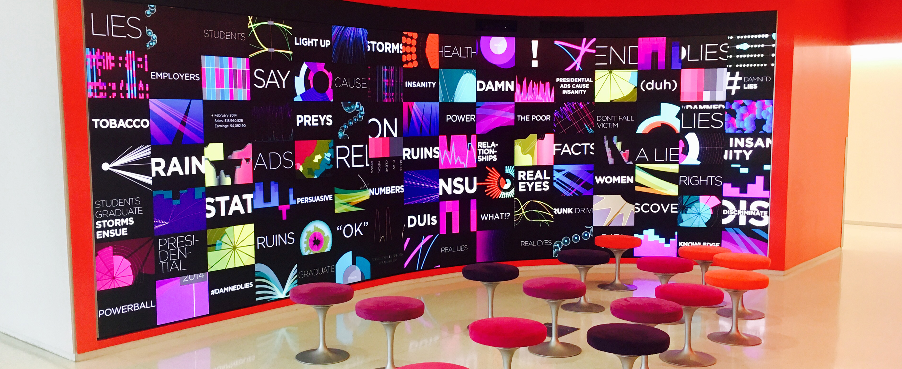
Data Visualization – North Carolina State University
“There are three kinds of lies: lies, damned lies, and statistics” (Benjamin Disraeli via Mark Twain) is a phrase describing the persuasive power of numbers, particularly the use of statistics to bolster weak arguments. It is also sometimes colloquially used to bring doubt to statistics that are used to prove an opponent’s point.
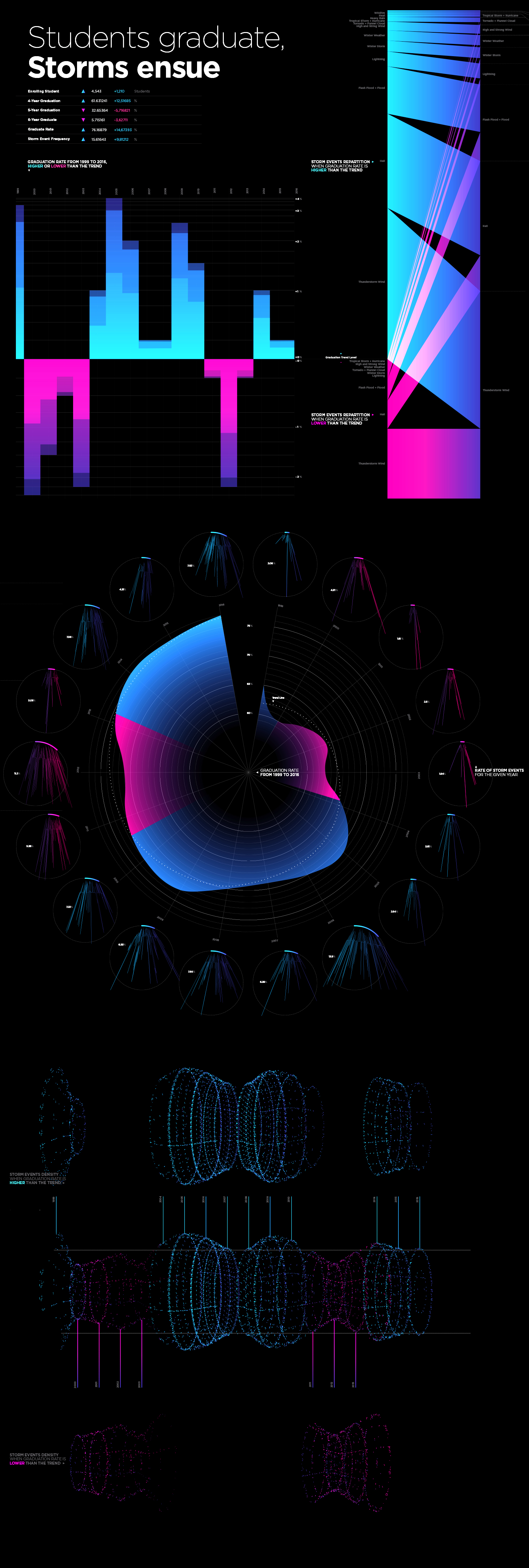
× North Carolina State University Graduation Rates (1999–2016)
× Storm Events Database—Wake County (1999–2016)
I began the project by choosing two unrelated datasets. The first one was the North Carolina State University Graduate Rate dataset. The second dataset was the Storm Events Database of Wake County. Both datasets overlapped the time period of 1999 to 2016.
I chose each of these datasets with certain interests in mind. The rationale for my choice of the graduation database came from the fact that our final visualizations are being displayed in one of the student libraries at North Carolina State University—Hunt Library. I chose the storm events database as I became interested in this subject upon my arrival in the United States where I was introduced to new kinds of storms, such as tornadoes and hurricanes.
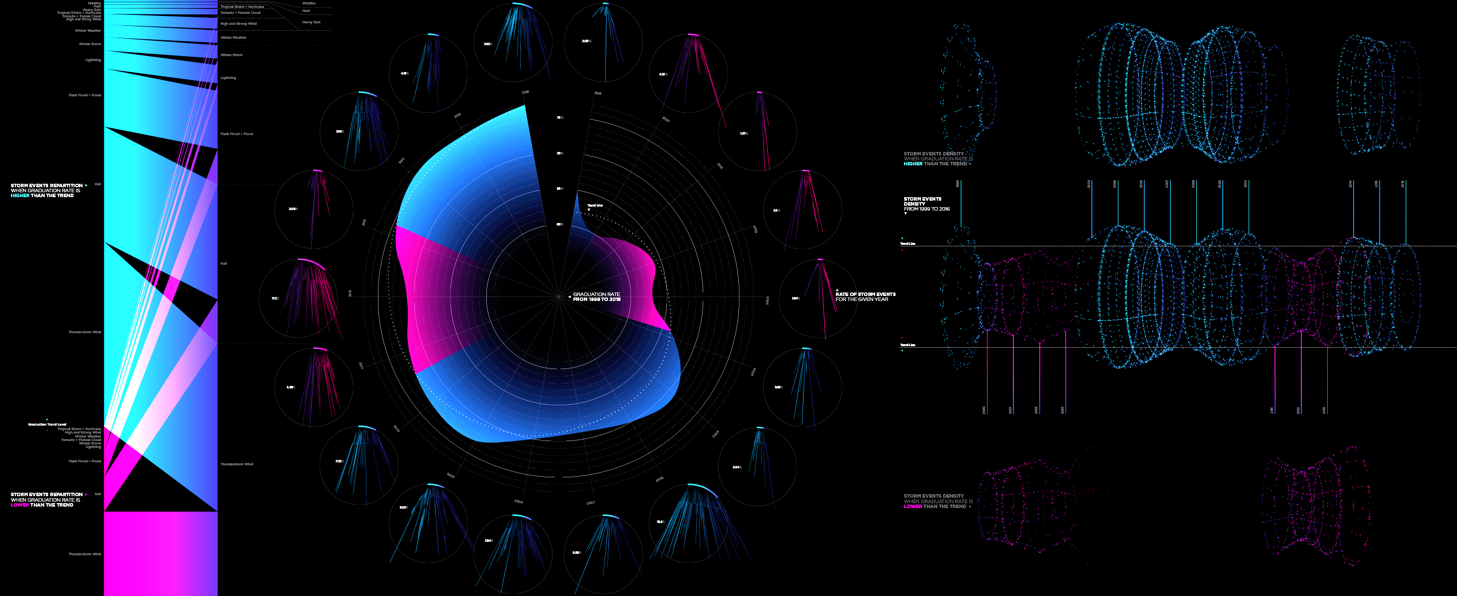
I started the project by analyzing the data to gain a global overview of its content. After cleaning and inspecting the data, I created simple line graphs. This allowed me to be able to consider the data in a visual way to identify correlations. After comparing the graphs, I was unable to find a direct statistical correlation, but I did discover a strong correlation within the general trends. I started to compare the graduation rate trends with the frequency of storm events on an annual basis. In years where the graduation rate was higher than the trend, the occurrence of storm events was higher as well. For instance, 71% of lightning events in Wake County occurred in years when the graduation rate was above trend, and 69.2% of the storms events happened in those same high trends years.
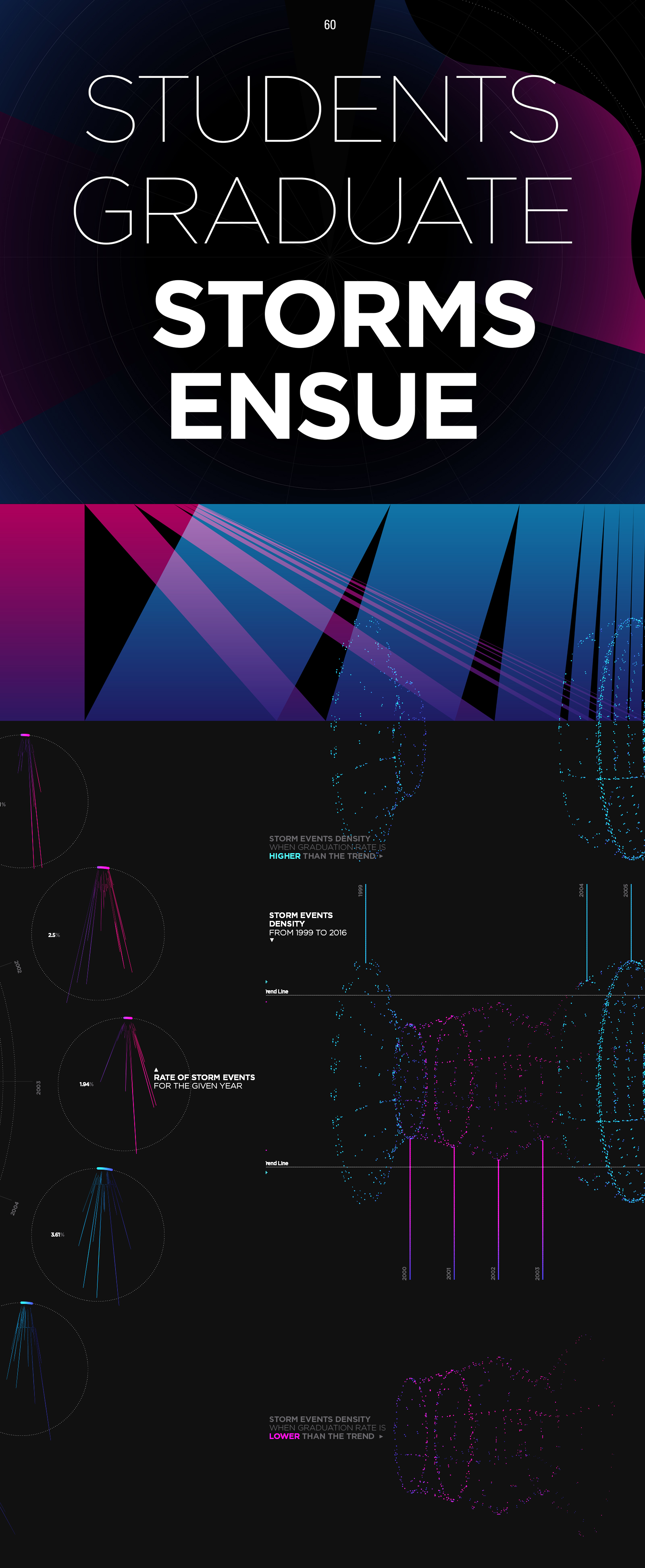
Students Graduate, Storms Ensue is the title of the data visualization system I created from the correlation found in the two random data sets. This title came from turning the correlation into a lie of causation where graduation rates directly impacts the frequency of storm events. The higher the graduation rate, the higher the occurrence of storm events. In addition, the data showed that more students enroll every year and students graduate faster; the 5-to-6-year graduation rate is decreasing while the 4-year graduation rate is on the rise.
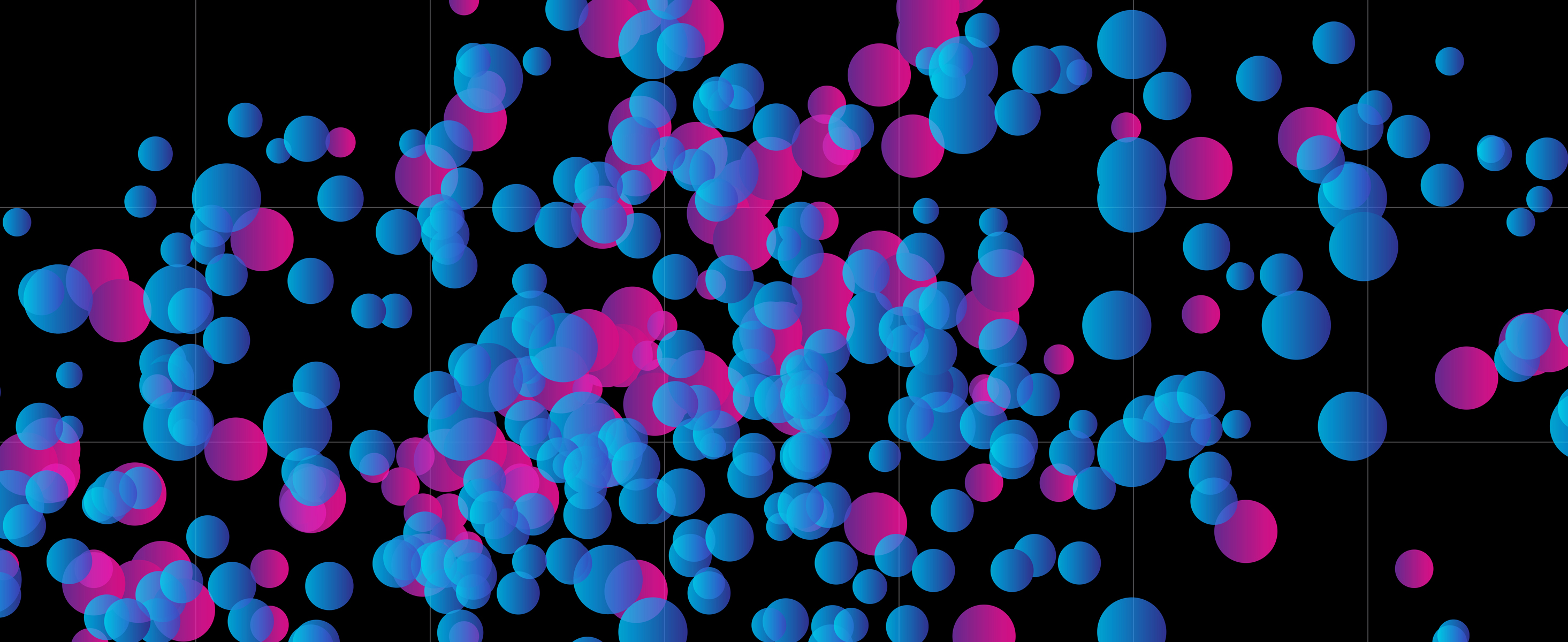
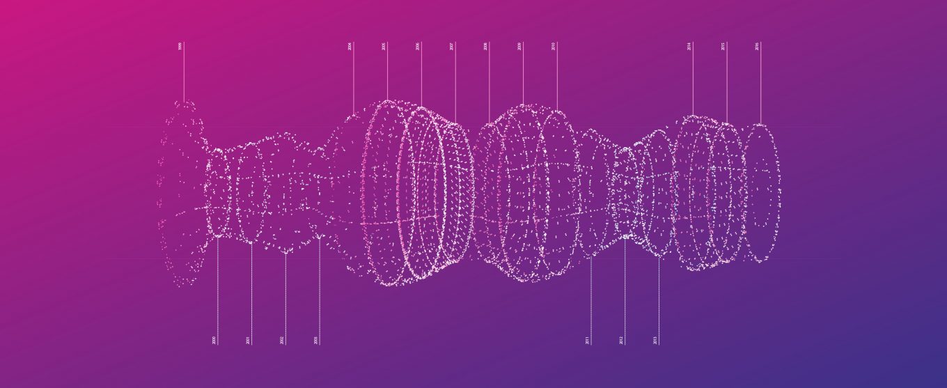
After having defined my lie and refined my story around the correlation of these two datasets, I started to design a range of graphical visualizations. For clarity, I decided to compose a dashboard to present the information using different approaches. The idea of the dashboard, the scattered data visualizations, and the circular diagram came from typical scientific weather visualizations, such as polar coordinate graphs and vortex-like 3D models. The complexity of the dashboard implemented multiple components, further reinforcing the lie by adding complexity to the data and suggesting scientific truth.